User Scenarios are the stories that your users act out. Visual predictions of how your users will interact with your website to achieve a given goal
Let you visualise what your future users will look for when trying to complete tasks on your side. If they fail at your task, at least they’ll showcase what needs to be fixed to solve the problem.
Should outline the who, what, how, why on your usage
User Scenario mapping can visualise the steps/predictions of a user’s experience on your website.
A Scenario is a narrative describing forseeable interactions of types of users (characters) and the system. Scenarios include information about goals, expectations, motivations, actions and reactions.
Scenarios are neither predictions nor forecasts, but rather attempts to reflect on or portray the way in which a system is used in the context of daily activity.
I believe the most important part of the lecture pod is the section that outlines that User scenarios are important to visualise the interaction of a predicted user will interact with your project.
User personas have been used since the mid 1990s. They are fictional users as a representation of real users of the future of how people will use your experience. They are a hypothesised group of users.
Could include information regarding user’s goals, behaviours, environment and reasons for using said service/product, age, sex, occupation, hobbies, likes/dislikes.
Universal design is the concept that you’re designing for any and all people. It is hard to design user persona’s for a large and varied user base. Try to satisfy the core audience and still tailor to fringe users.
Always develop personas, utilise research to gain more insight on your users.
Get feedback from users to further development. This could bring to light new ideas. Can further define your persona and create an optimal experience.
Difference in various User path tasks.
I believe the most important point in the lecture was about researching to gain insight on your users. Always utilise exemplars of other products/services in the same market as yours to gauge how users operate or enjoy what is being presented to them. If they are unhappy, you are able to alter your product to soothe them into transitioning into yours rather than an existing one with said problem.
Instructional Design is how to “do something” or the explanation of “how something works”
It is the practice of design to make the activities in our lives less confusing and lower the amount of frustration in completing tasks.
We interact with instructions through our daily life, eg. audio instructions, ticket machines or parking meters, operating domestic appliances
Poorly designed instructions can create frustrating experiences for users
Visual instructions – language free (maximises global market but less ability to understand with lack of step description)
Research into accurate and informative instructional design is a must
WORKING MEMORY – How we manipulate information stored in our short term memory.
Things that are closed together are viewed by the user as related. (DO NOT DESIGN WITH THIS FAULT)
Photography can be too detailed for instructional design as there is not differing subject matter weight.
I believe the point about information/subjects viewed close together being seen as related is the most important point as illustrated instructions can be confusing to distinguish when there is a lot of concentrated information in a small space.
kinds of interaction
Instruction – by clicking buttons
Conversation – back and forth dialogue
Manipulation – drag and drop elements
Exploration – open, playful, game like
Parking Meter with clear instructions on pricing and how to payInstructions on how to make a cake with a mixture of illustrative and dialogue instructional design
Instructions on how to operate an elevator with dialogue. Also includes individuals who are blind by incorporating braille into the design.
My project is going to be an interactive informative piece about the dangers of over fishing. The project will outline endangered species of the Australian surrounding oceans and reasons affecting their lack of population. I wanted to do a fishing boat adrift the ocean and a pan/scroll downwards type of art style where the more endangered fish are towards the bottom.
WHO
My target audience will be for recreational fishermen and individuals of ages 30-40. The information will be a little bit more formal in regards to the terms and artwork within the interactive piece.
WHERE
This interactive informative piece will be used on government websites and media sites that have contextual meaning to the topic.
HOW
They will use it to educate the population about the dangers of overfishing and ways to avoid it such as conservation of marine life and fishing within moderation.
BRAINSTORM
User scenarios
My main users include consumers and commercial fishermen.
Their realistic goal is to limit the act of overfishing within Sydney waters or reduce it to none. Starting small and locally can result in further branching out with eco movements.
The user will utilise our website and content to further educate themselves on overfishing and the various species/ecosystems that are being affected by it. This may include reduction in population of various sea life species or how it affects the chain of an ecosystem.
This will be conducted via an interactive piece accompanied by textual information attached to various elements.
The project will be easy to navigate, not too much on the screen to avoid distractions and ensure full focus on the core information.
My website will have users interact with an interactive game that utilises a vertical scroll tool to venture deeper into the ocean. The deeper the user goes, the more endangered sea life species that appear. Each species element will feature an info bubble when hovered over. This info bubble will have information regarding reduction in population and other issues as a result of overfishing.
Mobile first is a new term used in the design sector. Designing for the smaller phone is more effective rather than downgrading from a larger screen.
Increase in wordpress blog type websites + theme market have resulted in a common similarity (pattern) in the design of basic websites. User interface patterns are utilized to ensure a smooth interaction for the user.
“… each pattern represents our current best guess as to what arrangement of the physical environment will work to solve the problem presented”
Christopher alexander et al., a pattern language, P. 15
PATTERNS ARE JUST PATTERNS, THEY MAY SOLVE A DESIGN PROBLEM, THEY MAY NOT. DO NOT TAKE AS THEM AS THE ONLY FORM OF DESIGN SOLUTIONS
The hamburger button is used to save space on the screen. Once clicked, it will drop down a menu bar to navigate to other various areas of the site.Something simple to ensure a smooth and flowing user experience by producing all the information in concise and easy to understand steps.One long vertical or horizontal (normally vertical) scroll that takes the user through a story as the progress through the scroll.Movable single spaced subject matter that can be identified as “cards”.Simple photo that catches the attention of the user to highlight the theme or subject matter of the site.Loading animations must match your sites personality and aesthetic. Don’t just place them for no reason.To create clean design that focuses on User ExperienceBecome incredibly popular thanks to mobile and internet usage. It’s a simple function that allows users to build a fully working website that adapts to the devices screen.Flat design is clean, minimalist and the easiest for UI.
I believe the most important part of the lecture pod was identifying the importance of responsive design and its usefulness in order to create adaptive content for all devices.
A flow plan identifies the distinct faces that can be portrayed in a design process. These flow plans usually begin with an idea or concept and follow a loose journey to achieve a finalised end goal.
Project ideas normally start low tech, low detail pencil drawings, sketches and various sticky note arrangements to form a draft flowchart or brainstorming map. This helps develop a low level consensus on the problem and what you’re trying to achieve.
Diagramming tools can help build that draft flow chart into a visual design process.
Prototypes should be utilised in order to showcase a context for your invention.
Build scenarios and personas of individuals who will potentially use the device. Surveys, focus groups and ethnography can be used to identify interest.
Precedent study, studying existing products to find a hole in the market or lack of substance somewhere that can be fulfilled with your new invention.
Context includes the context for use and the context of use.
Once the designer understands the context for an individuals behaviour, they are able to design a product more suitable for the situation.
What is the situation?
What’s the setting or environment in which the interface or the device will be used?
Is it public or private?
Is it conductive?
WHO WILL BE USING THE DEVICE OR INTERFACE?
Will it be used by one person, or multiple people?
How long will the interface be used?
Will the person be able to focus on their task, or will they be interrupted while using it?
DOES THE EXPERIENCE NEED TO BE EXTREMELY SIMPLE?
How much complexity can be accepted?
WHAT ARE THE PERSON’S NEEDS AND GOALS?
What are they trying to accomplish or complete?
During the lecture pod, I believe the process of how a concept becomes a reality is the most important point. The flow diagram displaying how basic drawings become a working prototype displays it perfectly.
Interaction design as a field started when the first screen was designed to hold more than static copy. Everything that is interactive is considered a form of interactive design. This may include but not limit to buttons, forms and clickable links. “The interactive designer has 3 questions to answer. How do you [do, feel or know] something” – B. Verplank. According to Verplank, interactive design consolidates how to solve a client’s problem through the use of interactive media.
During an interaction, the more engaging an interaction is, the reactive factor increases as well. This example is derived from two interactions, one with a vending machine and the other a conversation between two people. The vending machine’s interactive design is to input the product they want, pay for it and finish the transaction. The vending machine cannot engage with the client’s requirements further than delivering the product while a good conversation can cause an increased reaction from both individuals as they engage in increased conversation over time.
In my opinion, the section in the lecture pod outlining that Interactive media is not about information, but about experience is the most important point. Creating this experience for others we must correctly build and structure the information we are given for these experiences.
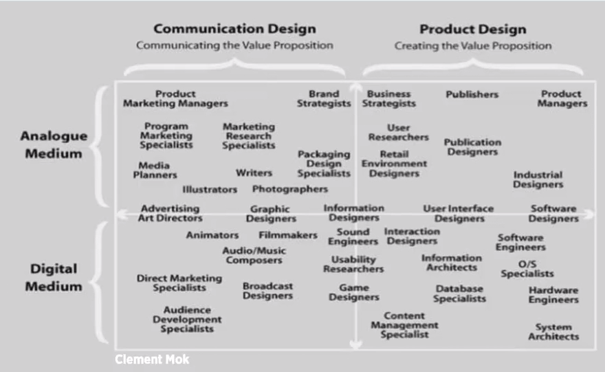
Mok, C. Shedroff, N. (2001) Experience Design 1. New Riders.
Interactive Design
Interactive Design is the process of creating something that integrates human function and machines together. This form of design analyses our day to day requirements and creates a product that requires a form of human interaction in order to solve. This may include online survey forms where an individual is required to fill their information in. The information is then consolidated into a section for the surveyor in an easy to read manner. Interactive Design is designing something of quality.
Spotify is an example of interactive design in audio media. Through spotify’s intelligient learning algorithm, as the user diverges into the various music they are interested in, spotify is able to recommend and push similar sounds and artists.The commbank app is among many other netbanking services that allows users to manage their money and spend on the go with ease. The easy to use interface allows us to integrate our finances and daily life without the use of visiting a bank. The ability to pay via phones has begun the path to physical card redundancy.Amazon’s new augmented reality application allows users to quickly browse a huge online marketplace at their finger tips. This application builds a 3D model of the product and allows the user to insert it into their living space to see what it would look like prior to purchasing. Augmented Reality paves the way for massive virtual implications to bring us one step closer to the future.